The standards we work by carry through to form.
The mark and the background system are derived from three standards — connect, grow, expand. Here is how they are built and how to use them.
How the form follows
It begins as a single dot, connects, closes into a circle, and expands outward again. The basic unit of the identity is derived in that order.
- Dot
- Connection
- Circle
- Expansion
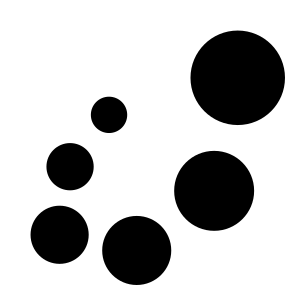
Six circles of differing size. The progression from the smallest dot to the largest circle is itself the connection and the expansion.
- Construction
- 6 circles · radius 18.20 → 47.32
- Clear space
- Symbol X · signature 0.8X (X = height of the mark)
- Minimum size
- 12px on screen · 4mm in print
- Contrast
- Ink on light grounds (0–40%), white on dark (60–100%)
Lockup
Symbol and logotype together. The symbol stands alone only where width is tight or an icon is called for.
- Primary (light ground)
- Reversed (dark ground)

- Symbol only
Colour
There is exactly one chromatic colour. Every gradient across the applied assets uses that single value, and on screen the accent is limited to one place per view.
#000000--color-inkBody text · symbol · primary button#46648c--color-blueThe only accent — links, active states, key action#ffffff--color-whiteCanvas · cards · text on dark grounds#333333--color-gray-80Strong body text · subheads#666666--color-gray-60Secondary body text · captions#999999--color-gray-40Muted text · placeholders#cccccc--color-gray-20Secondary borders · rules#e5e5e5--color-hairlineDefault 1px border · card edges
Background field
The background is not decoration — it is the mark itself, scaled up in true proportion. Aspect ratio chooses between the zoom and expand modes.
- Zoom — only part of a circle enters the frame
- Expand — all six circles visible, bleeding off the edges
In application
The same mark appears in different finishes depending on use. Its proportions never change.
- Holographic foil — business card finish
 App icon — symbol in a rounded square
 Orb — a single sphere lifted from the field
Typography
Typeface is chosen by the nature of the content, not by the colour of the surface. One test: is the brand speaking?
- SansFunction — navigation, buttons, labels, bodyConnecting people, data, and AI
- SerifBrand voice — declarations, mission, narrativeThe standards we work by carry through to form